Design process · Rhys Gourley
Not every project needs every step.
The skill is reading what a problem actually needs, and going there. Sometimes that's weeks of mapping. Sometimes it's an afternoon.
01 Judging rigour
Same instinct. Three depths.
All three start the same way: resolve structure before surface. What changes is how deep that goes, and when to stop. That call is the actual job.
- Slow and deep
WLTH Pay
Payments on Airwallex rails. Money moving, no undo.
Not a payment form. A system where the plumbing underneath never became the user's problem. Before opening Figma I mapped the whole payment lifecycle in FigJam and walked every flow with the backend engineers, checking it against what the Airwallex API could actually do. Get that wrong and it's not a redesign, it's real money going the wrong way.
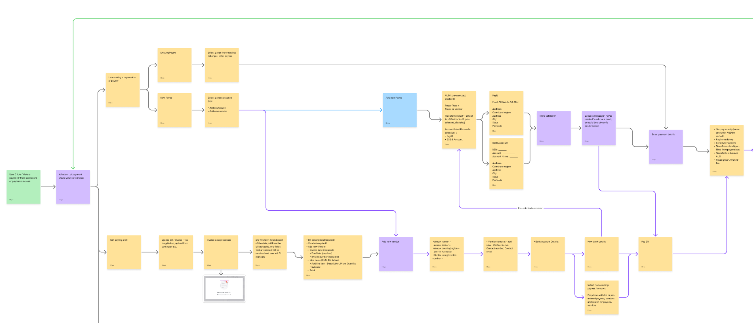
The payment lifecycle, mapped before any Figma work. Individual, batch and scheduled payments shipped under one model, and it reached engineering with fewer mid-build changes than anything I'd built at WLTH.
- Fast and lean
SafetyIQ
Enterprise safety software. People in the field rely on it.
A live ticket queue where every request looked separate but wasn't. Bad UX here isn't friction, it's a risk to someone on site. No long discovery phase. Working the queue with the PM, we realised five tickets were really one problem, so I built the approval steps out of a pattern the product already had.
Approval steps, built from a pattern the product already had. Approval groups shipped with zero new components. More capability, the same amount of interface.
- Light and invisible
Inspect Now
Virtual property tours at Little Hinges. Content versus conversion.
People loved the tours but weren't converting, and a normal lead-capture form would have wrecked the experience. So I built the capture as an opt-in layer sitting on top of the tour, quietly reading how ready a buyer actually was, and able to disappear completely.
The opt-in layer, sitting on top of the tour. Agents got a real buyer profile at the moment of enquiry, without the tour ever breaking stride.
WLTH earned weeks of mapping because being wrong was irreversible. SafetyIQ earned speed because the cost was a confusing state. Inspect Now earned restraint because the product was the tour, not my layer. Knowing which one you're in is the whole job.
02 The real process
Excitement, then a wall, then it breaks.
The honest version isn't a tidy diamond. Every real project runs the same emotional arc, and the breakthrough almost never happens at the desk.
Excitement
The problem opens up. Ideas come fast and cheap.
The wall
Doubt. The easy ideas don't survive contact with the real constraints.
Step away
The part people skip. Let it run in the background. The answer arrives away from the screen.
Breakthrough
It resolves higher than where it started. Now the surface design falls out naturally.
I've learned to trust the wall instead of panicking at it. It usually means I'm close to the real problem, not that the work is failing.
Instinct isn't a shortcut past evidence. It's how I decide how much a call needs: the risky ones get tested with real users first, the small ones don't.
03 Both ends at once
Visual-first. Systems came later. Now I build what I design.
I came up through graphic design, music artwork, brand. Craft before I had any vocabulary for UX. The systematic side, flows, structure, dependencies, came after. I read a problem from both ends at once: what it should feel like, and what it's structurally made of. Most designers are fluent in one and translate into the other.
That's why I design in code, daily. I'll take an idea to a working prototype myself and test it against real data and real API responses before engineering ever sees a spec. Nuxt, Next, GSAP, whatever the stack is.
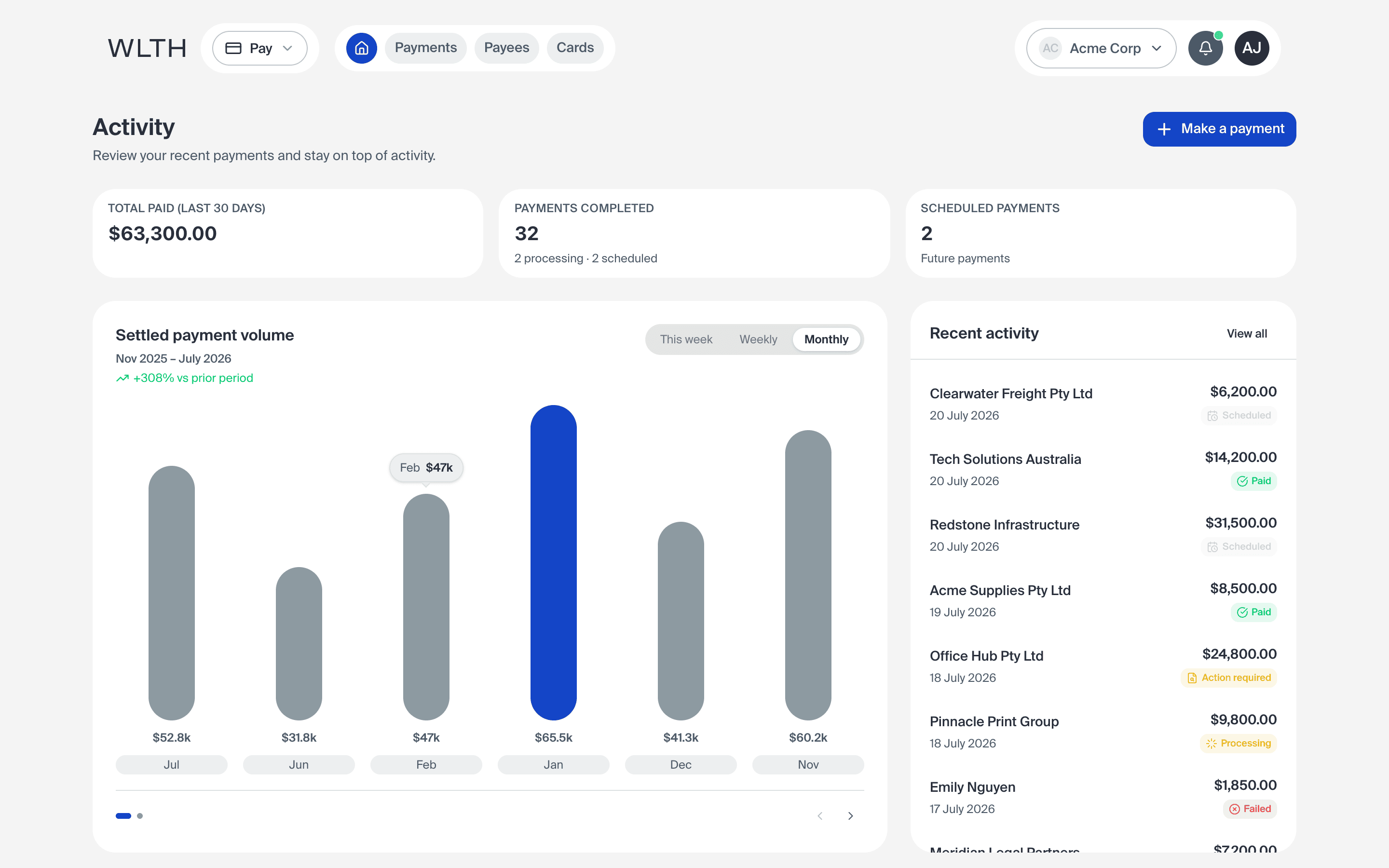
It changes what a design review is. You're reacting to something real in a browser, not a static mock, so the problems show up before engineering has to flag them. The proof is this page and this portfolio, both designed and built in code, not handed off.
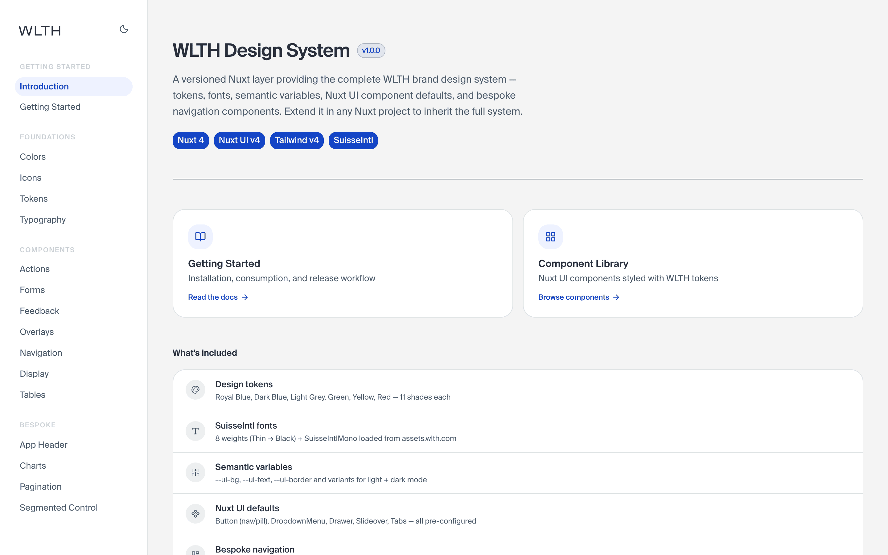
A system I build in code holds up without me in the room. The rules live in the code, not a doc nobody reads.
04 Past the ship date
The business call is part of the design call.
At Little Hinges I was the product designer and the product owner at once. The same person deciding what shipped and why, not just how it looked. That didn't switch off when I moved back into pure design roles.
Every outcome above is also a business one: fewer mid-build changes is engineering time saved, zero new components is maintenance you never pay for. At WLTH I set up a feedback channel and ran it with the PM, a direct line from users into what we worked on next, instead of it getting lost in a backlog for weeks.
Shipping doesn't prove a design works. Real usage does, so launch is where I start paying attention, not where I stop. Before it ships I decide what the design is meant to move, so there's something honest to check it against. Then I watch how people actually use it, where they hesitate, where they drop off. Speed is part of that too: a slow screen is a broken one.
A shipped design I can't measure is just an opinion that reached production.
05 One I got wrong
The example above is also where I learned it.
WLTH Pay is the project I hold up as resolving structure before surface. It's also where I learned to, because I didn't at the start.
We lost time to assumptions about what the infrastructure could support, treating the system model and the user model as sequential phases instead of resolving them together. In financial software, that's exactly where complexity leaks through to the person using it.
What changed: align on the API model on day one. The lifecycle mapping, and walking every flow with the backend engineers before opening Figma, is what that lost time bought.
06 Close
I resolve the structure, then let the surface fall out of it.
How deep I go depends on what's at stake. That judgment, not a fixed process, is the thing.
Rhys Gourley · Senior Product Designer · rhysgourley.me